Introduction
Color Theory in web design is pivotal, shaping both user experience and brand perception. This crucial element can make or break your website’s effectiveness. Understanding color theory is essential for any web designer or business owner looking to enhance their online presence.
Key Takeaways
- Impact of Color: Influences user experience and brand identity.
- Essential Knowledge: Critical for effective web design.
- Practical Use: Shapes how users interact with your website.
Color in web design isn’t just about aesthetics; it’s a strategic tool that affects how users perceive and interact with your site. This guide aims to provide you with a solid foundation in color theory, enabling you to make informed decisions about your website’s color scheme.

The Importance of Color in Web Design
Color is often the first aspect of a website that captures a visitor’s attention. It sets the tone and mood of your site, making it crucial in creating a strong first impression. Selecting the right colors can either draw in your audience or deter them, highlighting the importance of understanding color psychology and its impact on brand perception.
Beyond Aesthetics
Color in web design is about more than just visual appeal. It plays an important role in a site’s functionality, guiding users through the interface intuitively. Thoughtful color choices can emphasize important elements, direct user focus, and enhance readability, improving the overall user experience (UX).
Reinforcing Brand Identity
Colors are powerful tools for brand recognition. They can become synonymous with your brand, much like the iconic red of Coca-Cola or the blue of Facebook. A well-chosen color scheme makes your website aesthetically pleasing, reinforces your brand message, and connects with your target audience on a deeper level.
Fundamental Color Theory Concepts
Color theory is built on a few fundamental concepts that form the backbone of its application in web design. Knowing these basics is essential for creating visually appealing and effective websites.
Primary, Secondary, and Tertiary Colors

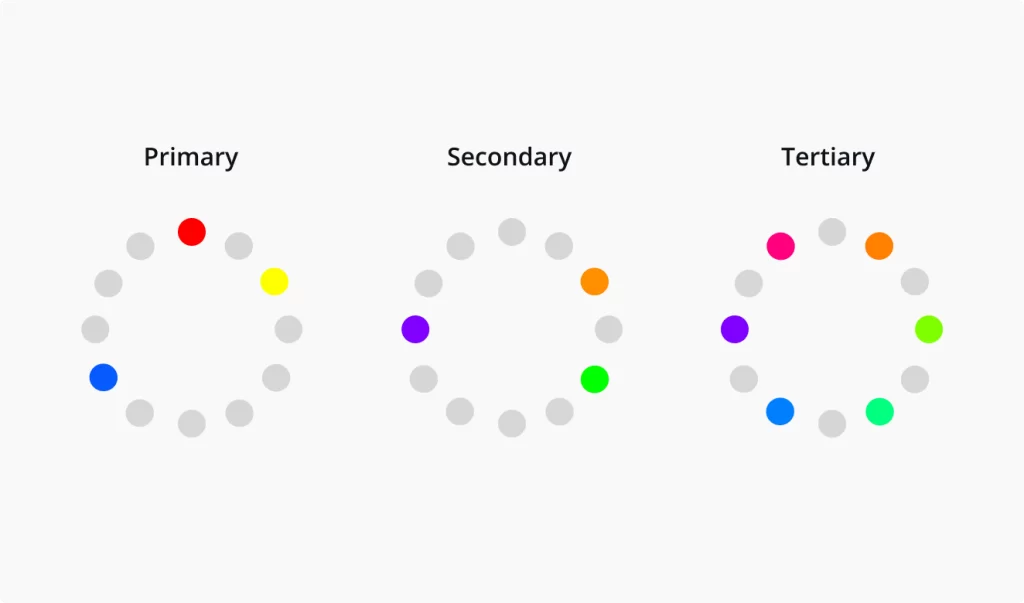
- Primary Colors: Red, yellow, and blue – the building blocks for all other colors.
- Secondary Colors: Green, orange, and purple – created by mixing primary colors.
- Tertiary Colors: The result of mixing primary and secondary colors.
The Color Wheel: A Visual Guide
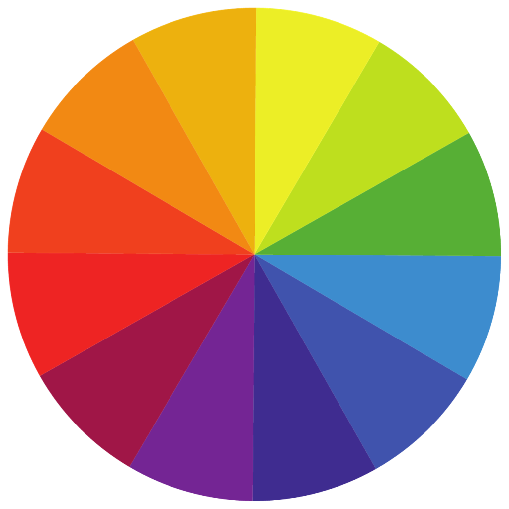
The color wheel is a crucial tool in understanding color relationships. It visually represents the spectrum of colors and their relationships, helping designers create balanced and harmonious color schemes.

- Complementary Colors: These colors, such as blue and orange, are opposite each other on the wheel. They create high contrast and vibrancy, ideal for dynamic designs.
- Analogous Colors: Colors next to each other on the wheel, like green, blue-green, and blue, go together. This scheme offers more harmony, is less contrasting, and is suitable for serene and cohesive designs.
- Triadic Colors: Involve three colors evenly spaced around the wheel, such as red, blue, and yellow. This scheme is balanced yet colorful, perfect for a vibrant and engaging design.
RGB v.s CMYK
- RGB (Additive Model): Used in digital designs involving light. Combines red, green, and blue light to create colors.
- CMYK (Subtractive Model): Used in print designs. It combines cyan, magenta, yellow, and key (black) inks to create colors.
Warm vs. Cool Colors: Emotional Impact

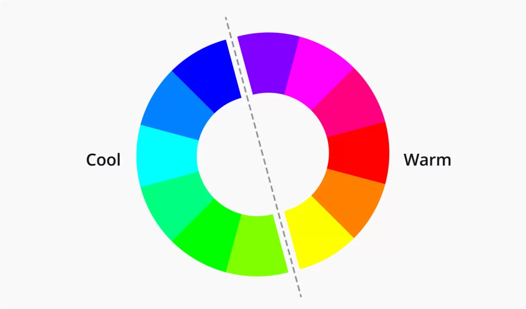
- Warm Colors: Red, orange, and yellow – evoke warmth, passion, and energy.
- Cool Colors: Blue, green, and purple – convey calmness, professionalism, and trustworthiness.
These fundamental concepts of color theory are instrumental in making informed decisions about color selection and combination in web design, directly impacting a website’s effectiveness and aesthetic appeal.
Color Vocabulary for Designers
A solid grasp of color vocabulary is crucial for web designers to communicate their ideas effectively and make informed design choices.
Tint, Shade, Tone, Hue, Saturation, and Brightness
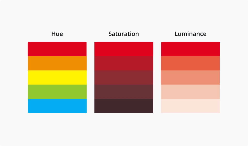
- Hue: The pure color without tint or shade.
- Tint: Adding white to a color, making it lighter.
- Shade: Adding black to a color, making it darker.
- Tone: Adding gray to a color, altering its intensity.
- Saturation: The intensity or purity of a color.
- Brightness: The lightness or darkness of a color.

Using Hexadecimal and RGB Values
Understanding and using hexadecimal and RGB values is essential in web design. These systems allow precise color specification, ensuring consistency across various digital platforms.
Hexadecimal (Hex) and RGB codes are essential for specifying exact colors in web design, ensuring consistency across different digital platforms.
Hex codes, a six-character string starting with a hash (#), represent a combination of red, green, and blue color values in a hexadecimal format. For example, #FF5733 is a specific shade of orange.
On the other hand, RGB codes express the intensity of red, green, and blue in a digital color using a range from 0 to 255. For instance, rgb(255,87,51) would represent the same shade of orange.
These codes are commonly used in CSS (Cascading Style Sheets) to define colors for web elements. By using Hex and RGB codes, designers can precisely control the colors in their web designs, maintaining visual consistency and aligning with the overall brand aesthetic.
The Science and Psychology of Color
Color theory is a fascinating blend of science and emotion, playing a crucial role in web design. It’s not just about picking colors that look good together; it’s about understanding how colors interact with human psychology and emotions.
Color Psychology: More Than Meets the Eye
- Emotional Response: Every color can evoke specific emotions. For instance, blue, often associated with stability and calmness, is widely used in corporate websites to instill trust. Red, known for its intensity, can evoke feelings of excitement or urgency, making it a popular choice for call-to-action buttons.
- Cultural Significance: Cultural perceptions of color vary significantly. While white is associated with purity and weddings in Western cultures, it symbolizes mourning in some Eastern cultures. This cultural context is vital when designing for a global audience.
- Historical Context: The historical use of colors also influences modern perceptions. For example, once a color of royalty due to its rarity and expense, purple still carries a luxurious and sophisticated connotation.
The Science Behind Color Perception
- Vision and Perception: How we perceive colors is a complex process involving light, our eyes, and our brains. This biological aspect plays a role in how different colors are used in web design to attract attention or create contrast.
- Color and Accessibility: Considering color perception differences, such as color blindness, is crucial in making websites accessible to a broader audience. For instance, using contrasting colors for text and backgrounds can improve readability for everyone.
Examples in Color Psychology
- Green for Calmness: Nature-related websites often use green to evoke feelings of peace and harmony.
- Orange for Energy: Fitness and sports websites utilize orange to communicate energy and enthusiasm.
- Black for Luxury: High-end brands frequently use black to convey elegance and exclusivity.
Understanding these facets of color psychology allows web designers to create more effective and emotionally resonant websites. By carefully choosing a color palette, designers can influence user behavior, convey brand values, and ensure that the website communicates the right message to its target audience.
Practical Application of Color in Web Design
The application of color theory in web design is not just theoretical; it’s a practical tool that can significantly enhance the effectiveness of a website.
Color in User Interface (UI) Design
- Navigational Clarity: Using color to differentiate elements helps users navigate your site more intuitively.
- Highlighting Important Features: Strategic color use can highlight key features like call-to-action buttons or important notices.
Tips for Choosing and Combining Colors
- Start with a Base Color: Choose a dominant color that aligns with your brand identity.
- Contrast for Readability: Ensure text is legible against background colors.
- Complementary Colors: Use the color wheel to find colors that complement your base color for a harmonious look.
- Consistency Across Pages: Maintain color consistency throughout your website to reinforce brand identity and improve user experience.
Role of Color in User Experience (UX) Design
- Emotional Resonance: Colors should align with the emotional tone you want to set for your website.
- Behavioral Influence: Certain colors can influence user actions, like red for urgency or green for relaxation.
- Accessibility and Inclusivity: Choose color combinations that are accessible to all users, including those with visual impairments.
By understanding and implementing these practical aspects of color in web design, you can significantly enhance your website’s aesthetic appeal and functionality. The right color choices enhance your site’s look and user-friendliness while aligning it with your brand’s identity.
Different Color Schemes and Their Uses
The choice of color scheme in web design can drastically influence the look and feel of a website. Different schemes cater to different purposes and aesthetics.
Overview of Color Schemes
- Monochromatic: Uses variations in lightness and saturation of a single color. Ideal for minimalist and clean designs.
- Analogous: Involves colors that are next to each other on the color wheel. Creates a serene and comfortable design.
- Complementary: Uses colors opposite each other on the color wheel. Offers high contrast and vibrancy, suitable for dynamic and energetic websites.
- Triadic: Uses three evenly spaced colors on the color wheel. Balanced and harmonious, it is perfect for a vibrant yet balanced look.
Guidelines for Selecting and Implementing Color Schemes
- Understand Your Brand Identity: Choose a color scheme that aligns with your brand’s personality and message.
- Consider Your Audience: Different demographics may respond differently to various color schemes.
- Test and Iterate: Experiment with different schemes and gather user feedback for the best results.
Case Studies of Effective Color Schemes in Web Design
- E-commerce sites often use complementary colors to highlight products and call-to-action buttons.
- Professional services websites might opt for monochromatic schemes for a more formal and straightforward look.
- Creative portfolios often use triadic schemes for a more dynamic and expressive feel.
Selecting the right color scheme is essential for effective web design, as it not only enhances the visual appeal but also contributes to the functionality and user experience of the site. Each scheme has its unique impact and can be used strategically to achieve specific design goals.
Tools and Resources for Web Designers
Recommended Apps and Tools
- Color Palette Generators: Tools like Adobe Color and Coolors help create and test color palettes.
- Color Pickers: Browser extensions and apps that identify color codes from any source.
- Gradient Generators: Tools like CSS Gradient are useful for creating smooth color transitions.
Online Resources and Guides
- Blogs and Tutorials: Websites like Smashing Magazine and CSS-Tricks offer in-depth articles and tutorials on color theory in web design.
- Online Courses: Platforms like Coursera and Udemy provide comprehensive web design courses, including color theory modules.
- Forums and Communities: Online communities like Stack Overflow and Reddit’s web design forums are excellent for advice and feedback.
By utilizing these tools and resources, web designers can refine their skills in color theory, stay updated with the latest trends, and continually improve their design work. Whether you’re a beginner or an experienced designer, these tools and resources are invaluable for mastering color application in web design.
Conclusion
Color theory is much more than a mere aspect of design; it’s a fundamental component that can significantly influence a website’s success. From shaping user experience to reinforcing brand identity, the strategic use of color plays a pivotal role in web design.
The Power of Experimentation and Learning
- Continuous Learning: The field of web design is always evolving, and so are the ways in which color is used. Staying informed about the latest trends and studies in color psychology and design is crucial.
- Experimentation: Don’t be afraid to experiment with different color schemes and combinations. User feedback and analytics can provide valuable insights into what works best for your audience.
This guide is just the starting point. Dive deeper into each aspect of color theory, practice with various tools, and constantly refine your understanding and application of color in web design. Remember, the right color choices can elevate a website from good to exceptional.
When mastered and applied, color theory can transform your web design projects, making them more visually appealing, user-friendly, and aligned with your brand’s message. Keep exploring, learning, and experimenting to harness the full potential of color in your web design endeavors.


